

Top 10 Colors of Spring

I love spring in Minnesota! One day the ground is covered in snow and ice, the next you wake up to 64 degrees and sunshine. My favorite part is that first day you can open the windows, go for a walk without your coat and crunch all those little bits of ice that are still lingering on the pavement. Everything outside is fresh and new, it’s no wonder spring feels like the perfect time for starting over. The urge for spring cleaning doesn’t have to be relegated to scrubbing windows and vacuuming the car. Sorting through your wardrobe and updating your look is another classic (and fun) part of this springtime tradition. So if you’re in the mood for refreshing your accessories, it’s time to get inspired with the top 10 colors for the season from Pantone’s newest Spring Fashion Report.
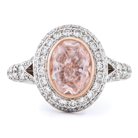
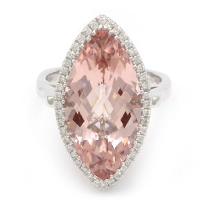
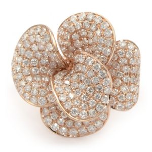
1. Rose Quartz
The soothing, calming nature of colors in the Spring collections are led by Rose Quartz, a persuasive yet gentle tone that conveys compassion and a sense of composure. Like a serene sunset, flushed cheek or budding flower, Rose Quartz reminds us to reflect on our surroundings during the busy but lighthearted spring and summer months.
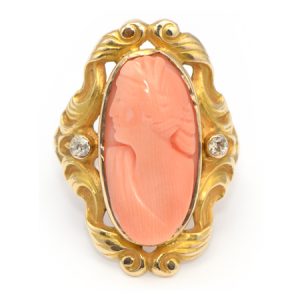
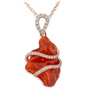
2. Peach Echo
The fashion and design communities, and consequently, consumers, have been in love with orange for several seasons. Coming to the fore this Spring is, Peach Echo, a shade that emanates friendlier qualities, evoking warmth and accessibility. It is an all-encompassing, tempered companion in the playful orange family.
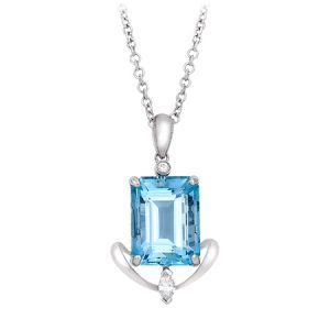
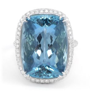
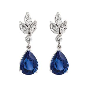
3. Serenity
Weightless and airy, like the expanse of the blue sky above us, Serenity comforts with a calming effect, bringing a feeling of respite even in turbulent times. A transcendent blue, Serenity provides us with a naturally connected sense of space.
4. Snorkel Blue
A maritime -inspired blue, Snorkel Blue plays in the navy family, but with a happier, more energetic context. The name alone implies a relaxing vacation and encourages escape. It is striking yet still, with lots of activity bursting from its undertones.
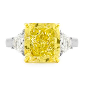
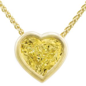
5. Buttercup
While the majority of the Spring/Summer palette trends toward calmness, a few diversions from the theme emerge that offer a contrast. With Buttercup, designers reveal a shining beacon transporting its wearer to a happier, sunnier place.
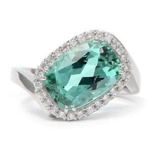
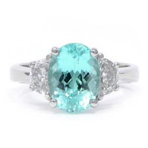
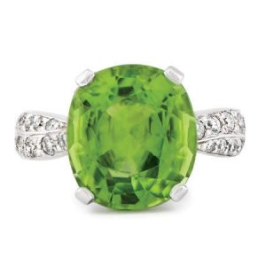
6. Limpet Shell
A shade of aqua that leans toward the green family, Limpet Shell is clear, clean and defined. Suggestive of clarity and freshness, its crisp and modern influences evoke a deliberate, mindful tranquility.
7. Lilac Gray
As in most any season, the need for neutrals arises. Essentially a basic, the subtlety of the lilac undertone in Lilac Gray, adds a distinctive edge to this classic gray shade. 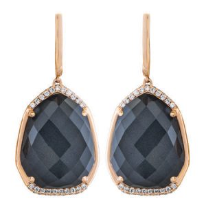
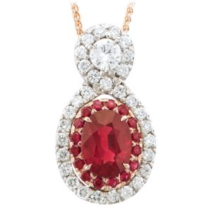
8. Fiesta
The high energy Fiesta is a harbinger of excitement, encouraging free-spirited exploration to unknown but welcoming locales. A strong and fiery, yellow-based Red, the vivid Fiesta provides a stark contrast to the calming, softer nature of this season’s palette.
9. Iced Coffee
A transitional color that will take us through the seasons, Iced Coffee manifests as another strong neutral for the season. With its natural earthy quality, the softness and subtlety of Iced Coffee creates a stable foundation when combined with the rest of this season’s palette.
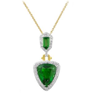
10. Green Flash
Green Flash calls on its wearer to explore, push the envelope and escape the mundane, radiating an openness that combines with the rest of the palette in unexpected but serendipitous ways. The popularity of this brilliant hue is representative of nature’s persistent influence even in urban environments, a trend continuing to inspire designers.
LOOKING FOR MORE?
» Read About: Spring Cleaning Your Jewelry
» Did you know Rose Quartz & Serenity are 2016’s Colors of the Year?
» Need an expert opinion? Ask Amy
